An app can pass every technical test and still feel wrong the moment someone opens it. Wrong spacing, navigation that doesn't behave, gestures that fight the user. People can't always name what's off. They feel it in seconds, and that friction costs you trust faster than any bug.
The Apple Human Interface Guidelines exist to close that gap. Follow them and your app works the way iPhone and iPad users already expect, with nothing new to learn. The stakes went up in 2025. Apple shipped Liquid Glass across iOS, iPadOS, macOS, watchOS, and tvOS, its biggest visual overhaul since 2013, and the HIG is where the rules for it live.
This post covers what's inside the HIG and how to find your way around it, how Liquid Glass changes what a native app looks like, how HIG alignment connects to App Store approval, where accessibility fits, and which official Apple design resources speed up the build. No fluff. Just what you need to ship something Apple users trust from the first tap.
What the Apple Human Interface Guidelines Are and Where to Find Them
The Apple Human Interface Guidelines are Apple's official design documentation for building native-feeling apps across every platform the company ships. You'll find the full resource at "developer.apple.com/design/human-interface-guidelines" — bookmark it now.
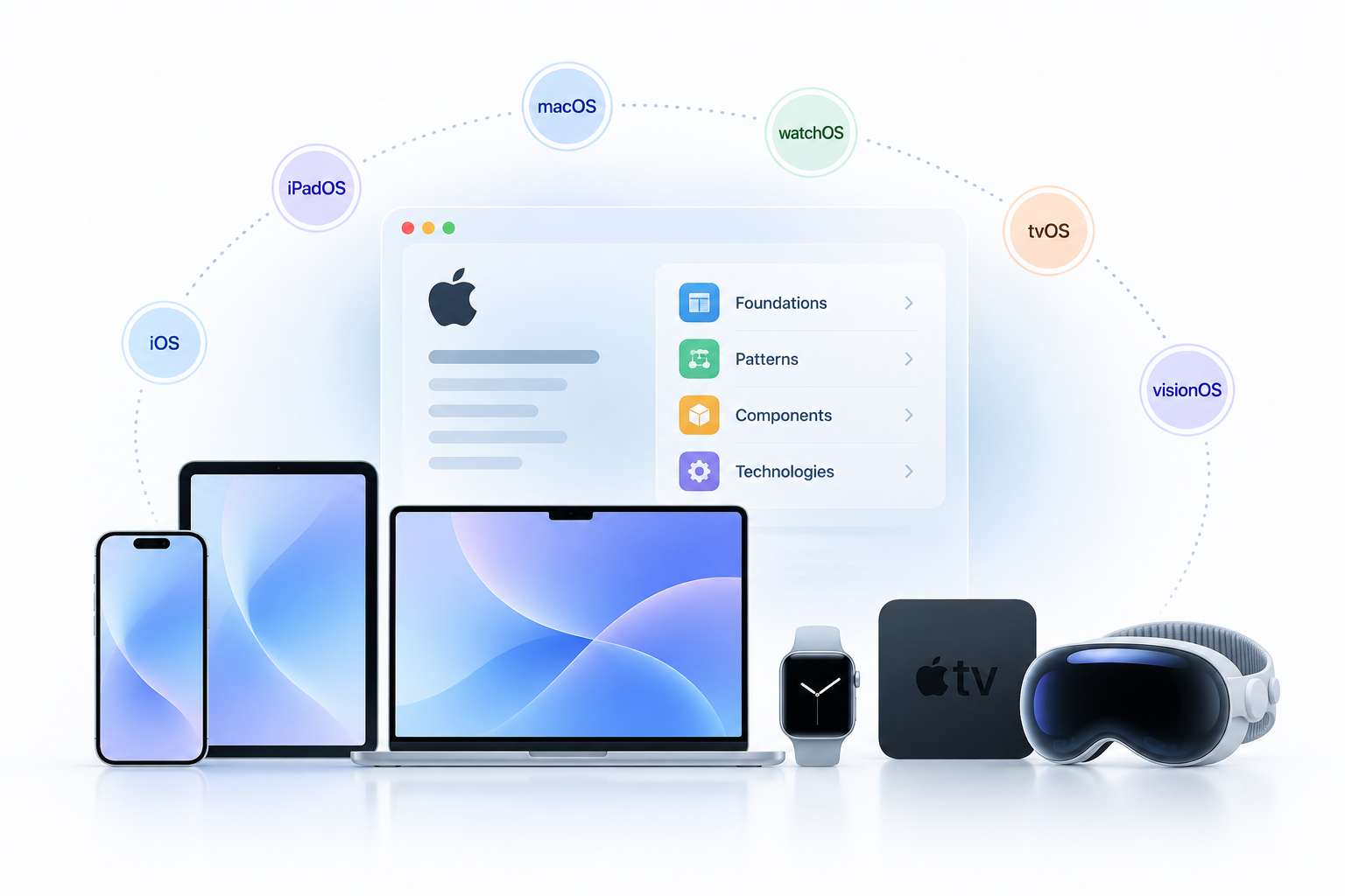
One thing to know before you dive in. The HIG used to ship as a separate document per platform. It doesn't anymore. Apple merged everything into one unified resource that covers iOS, iPadOS, macOS, watchOS, tvOS, and visionOS together, so shared design approaches sit in one place while platform-specific details stay called out where they matter. That change matters because the interaction model on an Apple Watch is nothing like designing for a 27-inch iMac. Touch gestures, cursor behavior, Digital Crown input, and spatial computing with visionOS each need their own thinking.
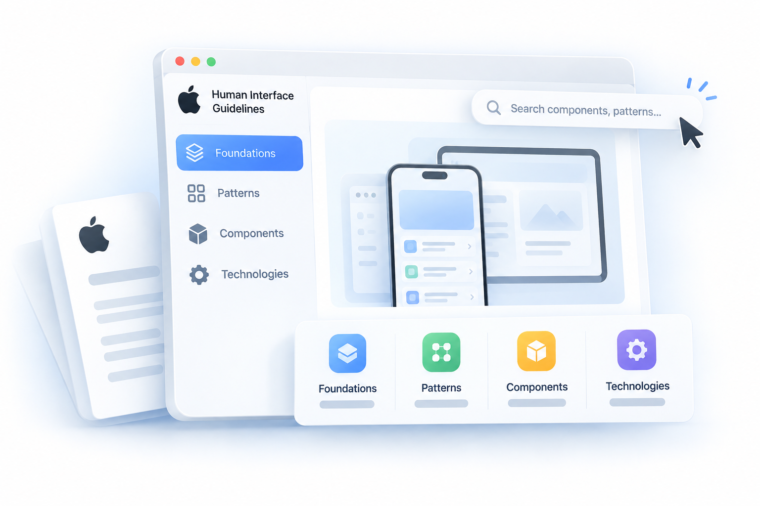
The documentation breaks into four areas:
Foundations — Color systems, typography, layout grids, and the visual principles that set your app's baseline
Patterns — Common user flows like navigation, searching, onboarding, and data entry
Components — Detailed specs for buttons, tab bars, sliders, alerts, and every standard UI element
Technologies — How platform-specific features like widgets, Live Activities, and SharePlay should be incorporated into your interface
Here's what actually changes by platform, because this is where designers frequently get tripped up:
Platform
Primary Input
Key Design Consideration
iOS / iPadOS
Touch and Apple Pencil
Touch target sizing, gesture conflicts
macOS
Cursor and keyboard
Hover states, menu bar, window management
watchOS
Digital Crown, tap
Glanceable content, compact layouts
tvOS
Remote, focus model
Focus-driven navigation, distance viewing
visionOS
Eyes, hands, voice
Depth, spatial anchoring, window placement
Apple revises the HIG with each major OS release, and every page now carries a change log that records what was edited and when. Check it when you adopt APIs from a new iOS or macOS version. The standards you designed against last year may have moved.
Why the Apple Human Interface Guidelines Matter for App Store Approval
Users who pick up an iPhone already have expectations baked in. They know where the back button lives, how a sheet dismisses, what a tab bar does. When your app honors those patterns, you get trust for free. When you break them, users don't think "interesting design choice" — they think something is broken.
That's the core business case for following the Apple Human Interface Guidelines. Familiar interaction patterns reduce support tickets, shorten onboarding, and increase the chance someone rates your app five stars simply because nothing frustrated them. Retention improves when your interface matches what users already know how to operate.
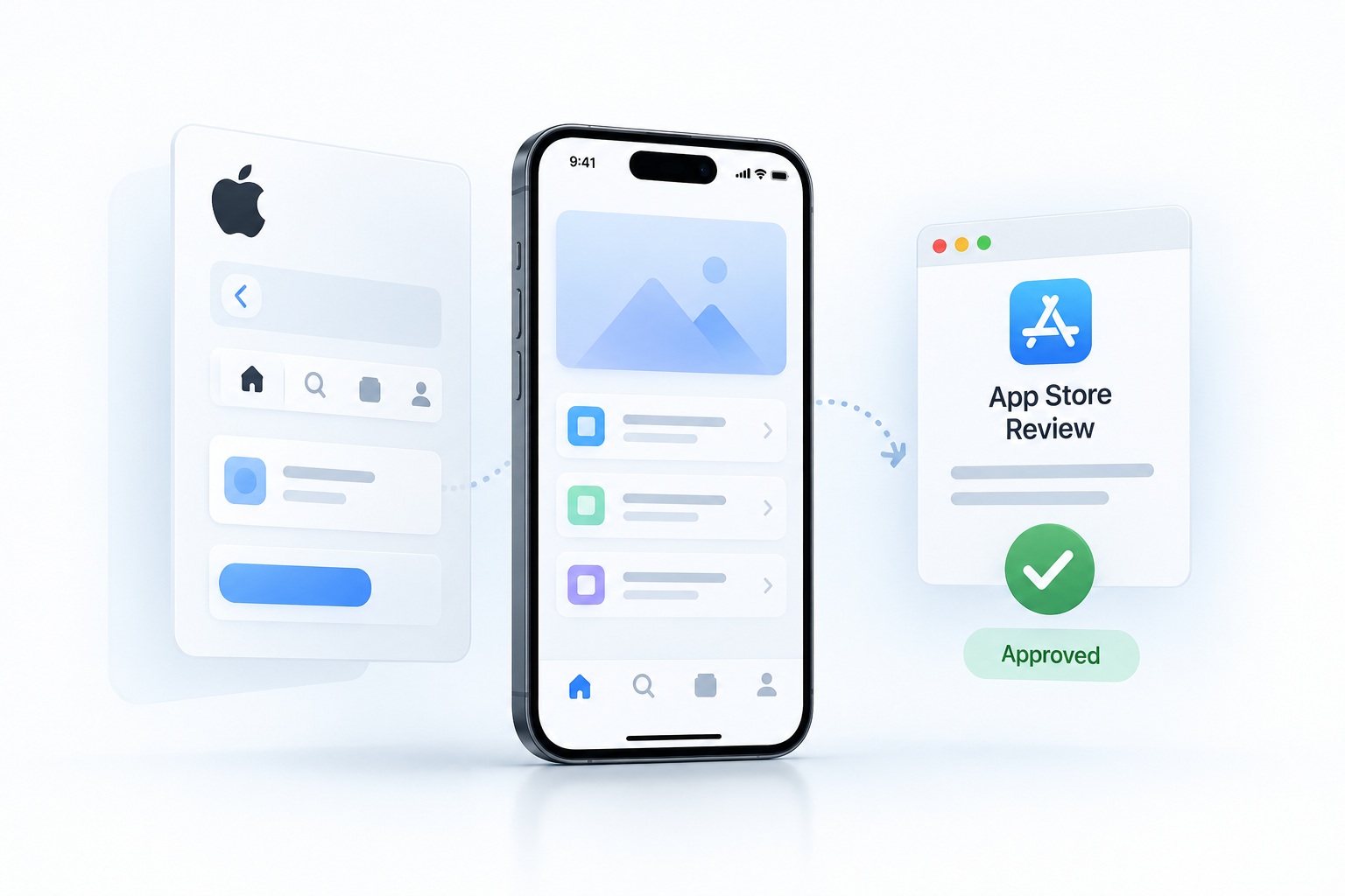
There's also a common point of confusion worth addressing directly: the Apple Human Interface Guidelines and the App Store approval guidelines are not the same document, and they don't serve the same purpose.
Apple Human Interface Guidelines
App Store Review Guidelines
Design and UX standards for building great interfaces
Policy rules governing what apps are allowed to do
Focused on usability, accessibility, and platform consistency
Focused on content, business model, and technical compliance
Maintained by Apple's design team
Enforced by Apple's review team during submission
Violation causes friction, poor UX, or negative ratings
Violation causes rejection or removal from the App Store
That said, the two documents overlap more than most developers expect. Reviewers do flag interfaces that deviate heavily from HIG-defined patterns, particularly when the deviation creates confusing or inaccessible experiences.
Here are the real risk areas where weak HIG alignment can create friction during App Store review:
Custom navigation controls that override or conflict with standard iOS gestures, like swipe-to-go-back
Non-standard interactive controls that obscure their function, making it unclear what tapping will do
Flows that bypass accessibility requirements, particularly apps with no VoiceOver support or inadequate touch target sizes
Modal presentations that trap users without a clear dismissal path, which reviewers flag as confusing navigation
Text that ignores Dynamic Type, making the app unusable at accessibility font sizes
None of these will automatically get your app rejected under a specific rule citation. But they create the kind of reviewer experience that prompts a closer look, and closer looks lead to revision requests that delay your launch.
Strong HIG alignment protects you on both fronts: it builds a product users want to keep, and it reduces the back-and-forth with Apple's review team that costs you time and shipping momentum.
How to Navigate the Apple Human Interface Guidelines
The HIG is large. Open it without a target and you'll browse for 20 minutes before finding the one paragraph you needed. Here's how to get straight to it.
Every platform's guidance splits into four layers: Foundations, Patterns, Components, and Technologies. Think of them as moving from broad philosophy down to exact specs. Since the HIG is now one unified document, you pick your platform and the same four layers organize what you see.
Three common lookups:
Tab bars - Go to iOS > Components > Navigation and search > Tab bars. You'll find maximum tab counts, label requirements, badge placement, and when to use a tab bar versus a sidebar on iPad. If your app also targets iPadOS, check the sidebar component page immediately after since Apple expects a different navigation pattern there.
Sheets - Go to iOS > Components > Presentation > Sheets. This page covers when to use a sheet versus a full-screen modal, detent configurations for the resizable sheet introduced in iOS 16, and how to handle navigation stacks inside sheets without breaking expected swipe-to-dismiss behavior.
Alerts - Go to iOS > Components > Presentation > Alerts. Pay attention to the button order rules. Apple specifies exactly which action gets the trailing position and why, and App Store reviewers will catch violations.
Quick lookup reference:
You need guidance on...
Go to...
Lock Screen widgets
Technologies > Widgets
Live Activities
Technologies > Live Activities
SharePlay integration
Technologies > SharePlay
CarPlay UI rules
Platform: CarPlay > Components
The Technologies section is where most developers miss requirements. Add a Live Activity without reading it first and you ship something that looks wrong on the Dynamic Island. Each Technologies page links back to related Foundations and Components, so follow those cross-references instead of treating each page as standalone.
One habit worth keeping. Use the in-page search and the change log rather than memorizing menu paths, because the unified HIG and the Liquid Glass updates have moved pages around. Search by component name gets you there faster than clicking through the tree.
Core iOS Design Guidelines Apple Expects in Great Apps
The iOS design guidelines Apple documents aren't abstract principles you interpret freely. They translate into specific choices reviewers notice and users feel within seconds.
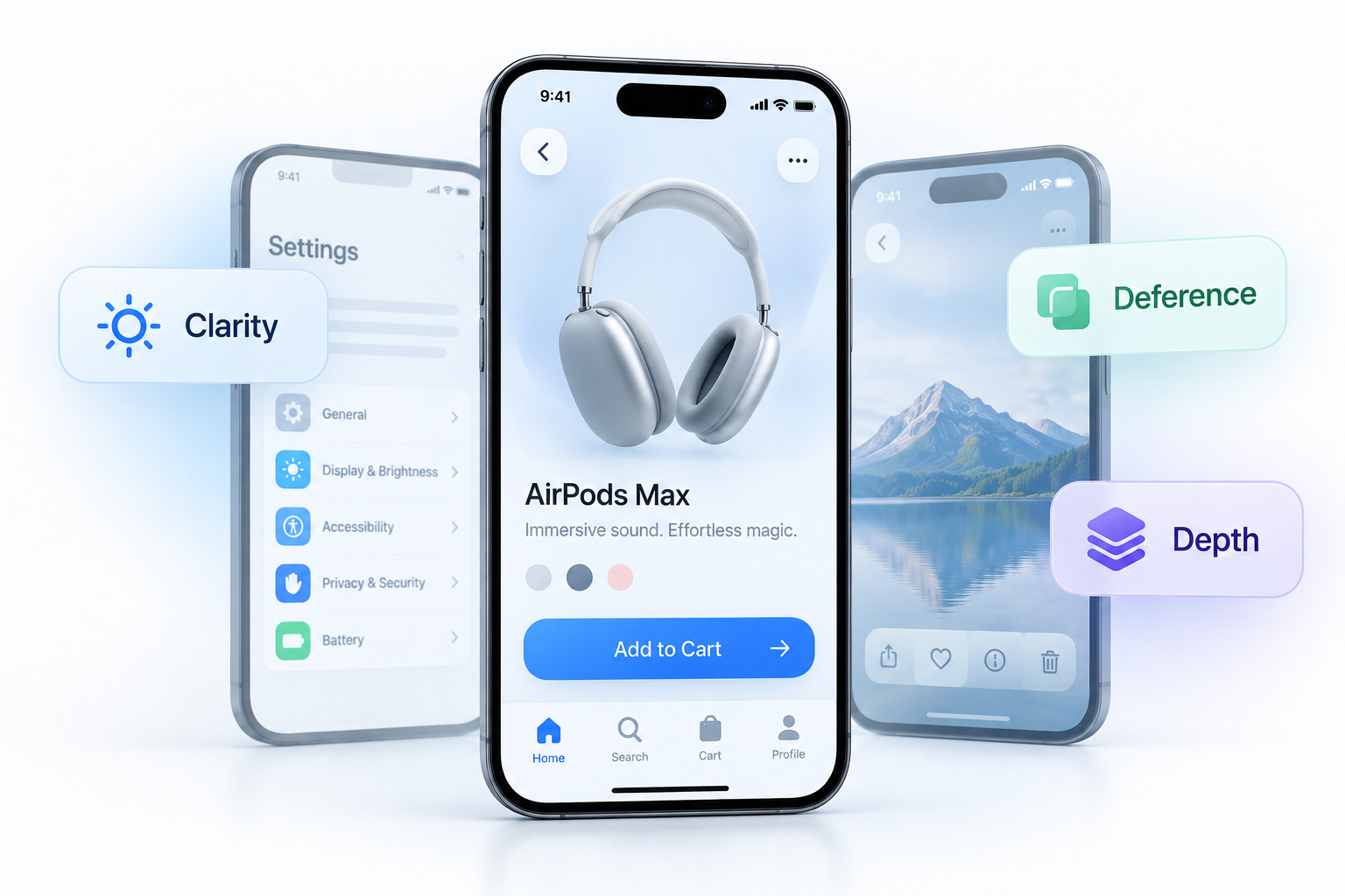
Apple's core trio is clarity, deference, and depth. Start with clarity, and know what Apple means by it. Clarity isn't about looking clean. It's about removing ambiguity from every interactive element. A button labeled "Submit" makes the user remember context. A button labeled "Send Payment" removes all doubt. That's clarity in practice.
The same logic applies to screen density. Compare a settings screen stuffed with toggles, labels, disclosure arrows, and banners to Apple's own Settings app. Grouped lists, consistent typography, nothing competing for attention. One screen teaches the user what to do. The other makes them work it out.
Deference is the second principle. Open Photos and watch the interface disappear when you view an image. The chrome fades, the content takes over. Now picture an app where the navigation bar, toolbar, custom tab bar, and a floating button all sit on one content view. That's the anti-pattern. Your UI exists to support the user's goal, not announce your product.
Depth is the third, and Liquid Glass has pushed it to the front. Apple now uses translucency, layering, and motion to signal hierarchy and where you are in a flow. Layers tell the user what sits above what, and what a gesture will do next. It's the principle the next section builds on, so hold onto it.
Here's where apps pass or fail the HIG test in practice:
HIG-aligned vs. not HIG-aligned
CTA label says "Add to Cart" not vague "Confirm"
One primary action per screen, not three equal-weight buttons competing
Content fills the viewport, controls appear in context, not persistent toolbars framing every view
System fonts at appropriate weight and size, not custom typefaces that break Dynamic Type
Tap targets at 44x44pt minimum, not icon-only buttons at 20pt with no padding
Error messages say what to do next, not error codes or a generic "Something went wrong"
Empty states include a clear next action, not a blank screen
Feedback rounds this out. Every action needs an immediate, honest response. A tap with no visual change feels broken. A loading state with no indicator feels frozen. Apple's own components handle this through built-in state changes, haptics, and animation. Replace a standard control with a custom one and you inherit the job of rebuilding all of that correctly, which is why the HIG pushes system components as the default.
Designing for Liquid Glass in the Apple Human Interface Guidelines
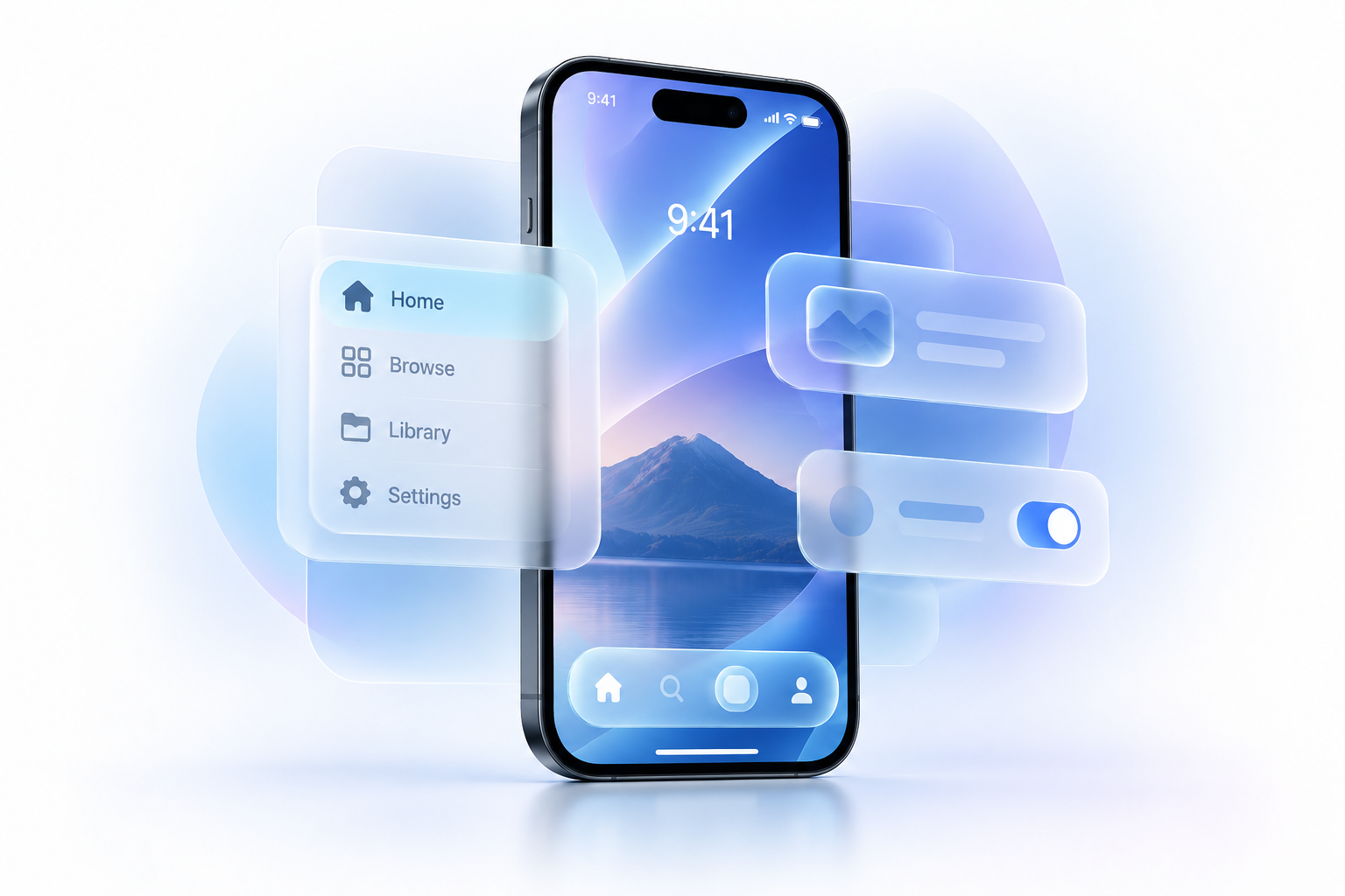
Liquid Glass is Apple's current design language, introduced at WWDC 2025 and now running across iOS 26, iPadOS 26, macOS 26, watchOS 26, and tvOS 26. It's the biggest visual change since the flat redesign of 2013. Interface elements take on the optical qualities of glass, translucent, layered, and reactive to the content and motion behind them. The HIG is where the rules for using it live, and reviewers now read your app against those rules.
The core idea is a separation of layers. Glass belongs to your controls and navigation, the layer that floats above your content, not to the content itself. Tab bars, toolbars, and sidebars sit in glass. Your actual screen content stays underneath, clear and readable. Get that split right and most of the work is done.
A few rules carry the most weight:
Let native components do the work: Build in the latest Xcode and standard SwiftUI, UIKit, or AppKit controls pick up the new look automatically. Custom controls don't, and you inherit the job of rebuilding the material by hand.
Keep glass in the control and navigation layer: Don't wrap normal content, cards, or list rows in glass. That's the most common mistake.
Don't stack glass on glass: Applying the effect to a parent and a child view at once creates visual noise and wastes GPU. Reserve it for static, top-level elements like tab bars and toolbars, not high-frequency scrollable lists.
Tint with restraint: Tinting generates tones from the brightness underneath, mimicking real colored glass. Use it only to mark a primary action, like a checkout button, not on every control.
Know the two variants: Regular glass is adaptive and legible by default. Clear glass is permanently transparent and needs a dimming layer, so use it only over bold, bright, media-rich content.
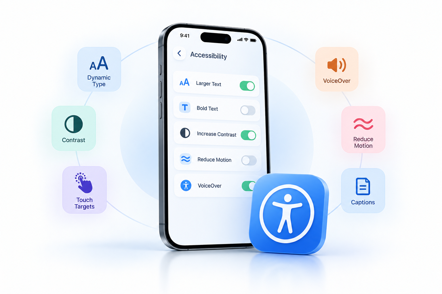
Accessibility stays first-class here. Liquid Glass responds to Reduce Transparency by turning frostier and hiding more of what's behind it, and it respects Increase Contrast and Reduce Motion. Test every screen with those settings on, in both light and dark mode and across wallpapers, because the same glass can read very differently against different backgrounds.
One more thing worth knowing. At WWDC 2026 Apple revised Liquid Glass for the version-27 releases after early feedback, reducing default transparency, reworking sidebar corners on iPadOS and macOS, refreshing app icons, and adding a settings slider that lets users choose between clearer and more tinted glass. So treat it as a living target. Check the change log when you adopt a new SDK, and lean on system components so those refinements reach your app without a rebuild.
When you'd hold back: if you support older OS versions, don't force the material everywhere. On older hardware apps keep their existing appearance, and the full effect only renders on newer devices. Adopt it incrementally, native components first, rather than redesigning every screen at once.
Build Accessibility in iOS Apps From Day One
Accessibility in iOS apps is not a polish pass you do the week before launch. It's a structural decision that affects your component choices, your layout logic, and your testing process from the first sprint. Miss it early and you're rewriting label hierarchies, replacing color-coded states, and fighting with VoiceOver navigation on a deadline.
Here's a working checklist your team can use across design, development, and QA:
Dynamic Type support: Every text element must scale correctly across all accessibility sizes. Test at the largest setting, not just the default.
Color contrast ratios: Body text needs a minimum 4.5:1 contrast ratio against its background. Large text drops to 3:1. Run Accessibility Inspector against both light and dark modes.
Touch target sizes: Apple's minimum is 44x44 points. Smaller tap targets create friction for users with motor impairments and inflate your error rates in analytics.
VoiceOver labels: Every interactive element needs a descriptive accessibilityLabel. "Button" tells a VoiceOver user nothing. "Add to cart, large blue sneaker" tells them everything.
Reading order: VoiceOver reads elements in the order they appear in the view hierarchy, not visual order. Validate this on a real device, not in the simulator.
Reduced Motion: If your app uses animations or transitions, respect the UIAccessibility.isReduceMotionEnabled flag. Replace motion with cross-fades or static transitions.
Captions and audio descriptions: Any video or audio content needs captions. Don't treat this as optional for users who are deaf or hard of hearing.
Color-independent states: Never communicate state through color alone. A red error field also needs an icon or text label. Users with color blindness depend on this.
Real-device testing with Accessibility Inspector: Xcode's Accessibility Inspector catches unlabeled elements, contrast failures, and hit area problems. Run it on physical hardware before any build goes to QA.
Sprint-level QA flow:
Designers validate contrast ratios and touch targets in Figma before handoff. Developers attach VoiceOver labels during implementation, not after. At the end of each sprint, a tester runs Accessibility Inspector on the new screens and navigates the full flow using VoiceOver only. Any unlabeled control or broken reading order is a bug, not a nice-to-have. Log it, prioritize it, and close it before the next sprint starts.
The Apple Human Interface Guidelines treat accessibility as a first-class requirement, not an accommodation. Your process should match that priority.
How to Apply the Apple Human Interface Guidelines in Product Design
Start with one rule your whole team can agree on: reach for a standard Apple component before you even sketch a custom one. UIKit and SwiftUI give you navigation bars, tab bars, list views, alerts, and form controls that already handle accessibility in iOS apps out of the box. Building custom alternatives from scratch burns sprint capacity and usually produces worse results for VoiceOver users.
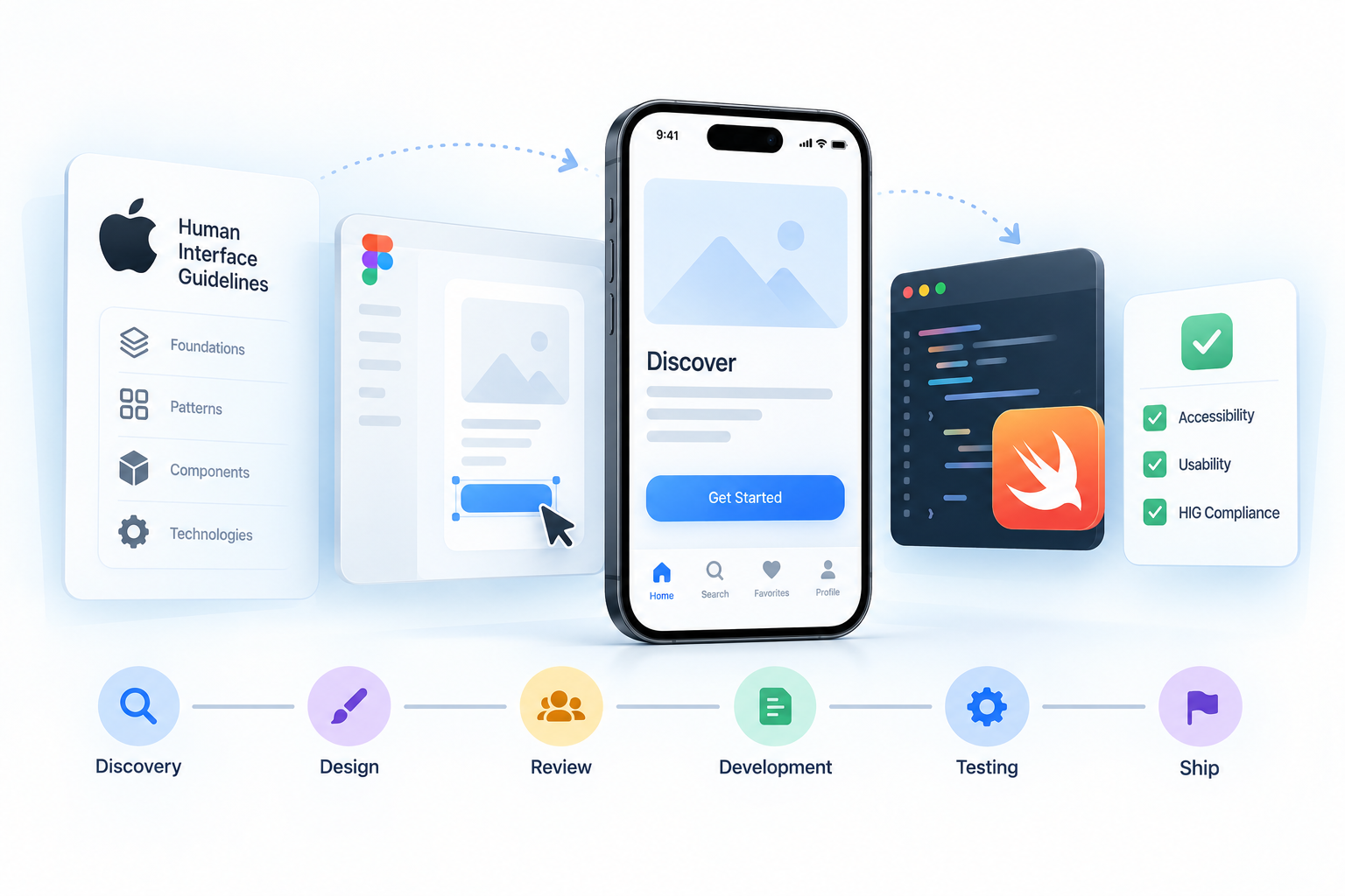
Here's a numbered workflow that takes HIG from documentation to shipped product:
Discovery: Map each planned feature to the relevant HIG section before wireframing starts. Navigation model, input patterns, data display — all of it has a documented Apple approach.
Design: Use Apple's official Figma UI kit as the component baseline. Justify every deviation in writing inside the design file.
Design review: Check the mockup against HIG criteria before it leaves the design tool. Non-negotiable gate, not a suggestion.
Ticket writing: Translate HIG requirements directly into acceptance criteria. "Tap targets must be at least 44x44 points" belongs in the ticket, not in someone's head.
Development: Engineers reference the same HIG URLs you linked in the design system. No ambiguity about intent.
Sprint review checklist: Run this before marking any UI story done.
QA: Treat HIG violations the same as functional bugs. Severity rating and all.
Sprint Review HIG Checklist
Navigation follows tab bar or navigation controller patterns, no custom chrome replacing system components
Body text uses SF Pro at minimum 17pt, with Dynamic Type scaling enabled
All tap targets meet the 44x44 point minimum, including secondary actions
Text contrast ratio hits 4.5:1 for normal text, 3:1 for large text
Motion respects the Reduce Motion accessibility setting, no forced animations
Spacing uses 8pt grid increments consistent with HIG layout guidance
VoiceOver labels exist on every interactive element, including icon-only buttons
Color never carries meaning alone, always paired with a label or shape cue
This checklist turns HIG from a reference document into a concrete quality gate. Your QA engineer and your designer are checking the same criteria against the same standard.
A few things worth connecting across your workflow: your design system documentation should reference HIG URLs directly so developers understand the reasoning, not just the rule. Your designer-developer handoff process needs to carry those HIG specs into component annotations. And your mobile accessibility review workflow should treat the checklist items above as the minimum bar, not the ceiling.
The teams that get this right don't treat HIG as a compliance exercise. They bake it into how work moves through the pipeline.
Official Apple UI Kits, SF Symbols, and Design Resources
Stop hunting across random community files for iOS components. Apple publishes official design resources that map directly to the Apple Human Interface Guidelines, and most teams either don't know they exist or aren't using the right ones.
Here's exactly what you need and where to get it:
Resource
Format / Tool
Download Location
When to Use It
Apple Design Resources: iOS and iPadOS
Figma, Sketch
developer.apple.com/design/resources
Start every iOS project here. Includes native components, color tokens, and text styles synced to current platform patterns.
Apple Design Resources: macOS
Figma, Sketch
developer.apple.com/design/resources
Required for any Mac app or Catalyst project where platform-native menus and controls matter.
Apple Design Resources: watchOS and tvOS
Sketch
developer.apple.com/design/resources
Use when designing for Apple Watch complications or Apple TV layouts with their unique spatial constraints.
SF Symbols App
macOS app (.dmg)
developer.apple.com/sf-symbols
Browse, customize, and export any of 5,000+ symbols before handing specs to engineering.
The Apple UI kits do one job well: they keep your team building against actual current platform components rather than outdated or community-approximated versions. When Apple ships a new OS with updated control styles, the official kits update too. Your design files stay accurate without manual maintenance.
SF Symbols deserves specific attention because it solves more than just iconography. Every symbol supports multiple weights (from ultralight to black), three scales, and four rendering modes including hierarchical and palette. That means your icons respond to Dynamic Type sizing, adapt to system accessibility settings, and visually match SF Pro without any custom alignment work. You get that consistency for free, which custom icon sets simply can't match across the full range of Apple interfaces.
Conclusion
The Apple Human Interface Guidelines aren't a philosophy document you read once and shelve. They're an active reference that shapes whether your app gets approved, keeps users engaged, and avoids a costly redesign after launch.
Your next step looks like this. Open the HIG and map it against your core screens. Check each one against Liquid Glass, since translucency, depth, and dynamic tinting now define what current feels like. Run an accessibility audit covering Dynamic Type, contrast, and VoiceOver. Then lock down your design system with standard components before you submit. That sequence alone catches most of what slows App Store approval and frustrates users later.
If you want an expert second set of eyes, Brilworks works with product teams on iOS design system reviews, pre-submission audits, and end-to-end iOS app development built to Apple's standards. Reach out and let's look at what your app actually needs.
FAQ
The Apple Human Interface Guidelines (HIG) are Apple's official design standards and best practices for creating intuitive, consistent, and high-quality user experiences across iOS, iPadOS, macOS, watchOS, tvOS, and visionOS. The Apple Human Interface Guidelines provide comprehensive guidance on design principles, interface elements, patterns, and platform-specific considerations.
Following the Apple Human Interface Guidelines ensures your app provides a familiar, intuitive experience that aligns with user expectations on Apple platforms. Apps built according to the Apple Human Interface Guidelines have higher approval rates in the App Store, better user reviews, improved accessibility, and greater consistency with native Apple applications.
The Apple Human Interface Guidelines cover all Apple platforms including iOS (iPhone), iPadOS (iPad), macOS (Mac), watchOS (Apple Watch), tvOS (Apple TV), and visionOS (Apple Vision Pro). Each platform section within the Apple Human Interface Guidelines addresses unique interaction patterns, screen sizes, and input methods specific to that device.
The Apple Human Interface Guidelines emphasize three foundational principles: clarity (making content and functionality easy to understand), deference (letting content take center stage with subtle interface elements), and depth (using realistic motion and layering to convey hierarchy). These principles guide all design decisions in the Apple Human Interface Guidelines.
The Apple Human Interface Guidelines are freely available at developer.apple.com/design/human-interface-guidelines. Apple regularly updates the Apple Human Interface Guidelines to reflect new OS features, design patterns, and technologies, making it essential to reference the latest version during design and development.
Co-founder of Brilworks. As technology futurists, we love helping startups turn their ideas into reality. Our expertise spans startups to SMEs, and we're dedicated to their success.