COOPERATION MODEL
ARTIFICIAL INTELLIGENCE
PRODUCT ENGINEERING
DevOps & Cloud
LOW-CODE/NO-CODE DEVELOPMENT
INDUSTRY
FRONTEND DEVELOPMENT
CLOUD DEVELOPMENT
MOBILE APP DEVELOPMENT
LOW CODE/ NO CODE DEVELOPMENT
EMERGING TECHNOLOGIES


Healthcare development is inherently challenging. With so many regulatory concerns involved, it requires careful development to design an effective user interface.
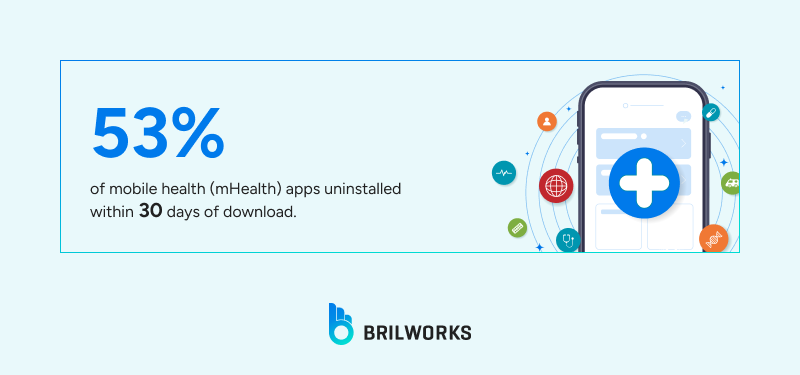
If we look at the data, healthcare apps often struggle with user retention. They tend to have low reinstallation rates and a high abandonment rate. A major challenge with these apps is the lack of sustained use. Recent studies show that user commitment to mHealth is low, with about 53% of apps uninstalled within 30 days of download.
Over time, the numbers drop even further. Retention rates for mobile health apps fall to 3.9% after six months. And direct reinstallation is generally rare. Taken together, these statistics do not paint a good picture.
A major reason for this trend is poor user experience. In this article, we’ll look at some of the key UX challenges in healthcare app development and how they impact user engagement.
As a healthcare development company, we have worked on over 30+ healthcare-related projects. Some of which were for optimization. In most of the projects we have worked on so far, poor UX has been a major issue.
By enabling wider, remote access to healthcare services, healthcare apps have transformed our daily lives. However, many apps still struggle to keep users engaged. Abandonment rates can reach 53% to 90% in the first month, and after six months, less than 5% of users remain. This is a big concern for health tech developers and agencies.
Poor user experience is a key reason for widespread disengagement. These barriers can lead to negative outcomes, and many apps fail because of poor UI and UX.
User preferences have changed. Many major healthcare apps still use outdated interfaces for onboarding and service requests.
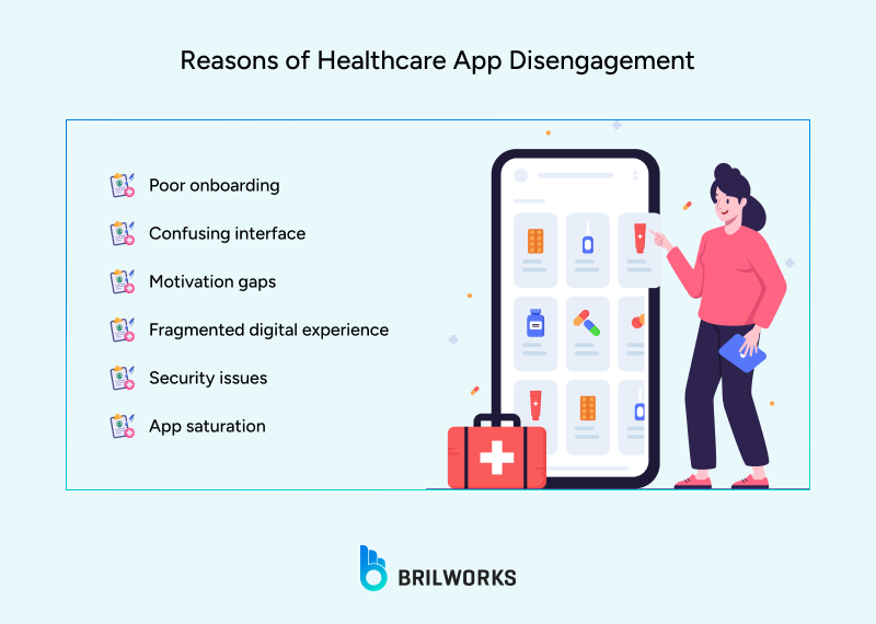
The first few minutes in a healthcare app are crucial. Overloaded screens, dense forms, or unclear actions can leave users confused or overwhelmed. If users face problems at this stage, most will not return. Industry benchmarks show that 25% of health app abandonments happen after just one use.
Health is an ongoing journey, not a one-time transaction. Unlike e-commerce or social media apps, healthcare apps must help users overcome natural lapses in motivation. Without features like habit trackers, reminders, or progress visualization,users can fall out of the engagement loop entirely.
Traditional mHealth apps, non-compatible with modern digital services, struggle to integrate with wearables, EHRs, or messaging tools. They provide a disjointed experience to end users. Now users interact with many digital channels. For example, a patient might track exercise in one app, get therapy reminders in another, and talk to their care team by email, with nothing linked together. This leads to 'app fatigue' and causes users to look for better options.
Strict privacy laws protect healthcare data. If users feel their health information is not secure or the app’s data is unreliable, they will stop using it. To build trust, apps need clear privacy and strong security features.
As more AI-powered solutions evolve, users expect healthcare apps to do more than just work. They want a great, personalized experience.
Every year, thousands of healthcare apps are released. With so many choices, even a small problem with UX or value can cause users to leave and not come back.
Lost Revenue
Decreased Outcomes
Operational Inefficiency

We know the challenges of developing healthcare apps. As a white-label software company in India, we offer free UI designs and ready-to-use solutions for the healthcare industry. We are consistently ranked among the top healthcare development companies. Assisting SMBs to overcome business inefficiencies through digital solutions, Briworks provides custom and off-the-shelf software for different needs.
If you are building a healthcare app from scratch or using a white-label solution, here are the important points to keep in mind to create a solid product.
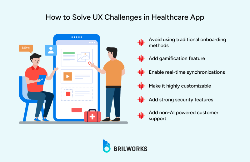
For our healthcare app Exora, we focused on making onboarding smooth. While some personal data was needed for better recommendations, we made the process simple at first. Traditional sign-up and login work. But features like one-tap sign-in and automatic detection of country code or basic fields improve the experience.
Below are some best practices we’ve outlined to help you create a seamless onboarding experience.
Use one-tap sign-in (Google, Apple, phone OTP).
Skip passwords at first; let users set them later in settings.
Auto-detect country codes for phone input.
Don’t ask for full profiles right away.
Start with minimal info, then use progressive profiling (ask more after trust builds).
Collect medical or health details only after users explore or see value.
Keep one action per screen: “Verify number,” “Select goal,” “Allow permission.”
Avoid dense forms. Use toggles, chips, or sliders instead of text fields.
Use micro animations or progress bars to show movement.
Show quick confirmations (“Verified!”) to reduce uncertainty.
Use a clear privacy line under every sensitive step.
Keep visuals calm (white backgrounds, soft tones, no alerts).
Add a subtle brand mark of reliability (like “HIPAA compliant” if relevant).
Offer “Skip for now” wherever possible.
Allow limited access or demo mode so users can feel the value before sharing data.
Use inline hints (“We’ll use this to personalize your care”).
Don’t overload with tooltips or pop-ups on first use.
If they reinstall, remember their session via secure token.
Auto-fill known data and jump them straight to dashboard.
Gamification is very effective. Healthcare apps are like learning platforms, helping users understand health trends as well as offering services. Gamification makes this process more engaging. In fact, 65% of users prefer apps with gamified learning, and almost 80% of gamified apps see higher user engagement.
Gamification can have many purposes. Features like daily streaks, milestone badges, progress bars, motivational nudges, and achievement celebrations help users stay active and consistent. However, gamification alone is not enough—how developers design and use it is what really matters.
Let’s explore some simple yet powerful ways to enhance gamification and turn a good feature into a great one. Content plays a key role in making that happen.
Use subtle progress rings, streaks, or levels
Visual feedback should feel like growth, not competition (for example, “You’re improving your sleep consistency” instead of “You ranked 5th”).
Show real progress metrics (steps improved, heart rate stabilized, sleep duration) instead of arbitrary points.
Divide long-term goals (like weight loss or stress control) into bite-sized milestones users can reach weekly.
Give micro-celebrations (simple animation, checkmark, soft sound) when they achieve a step.
Keep rewards meaningful—unlock new insights, recommendations, or content instead of generic badges.
Use streaks or daily check-ins, but frame them gently (“You’ve kept your routine for 4 days. Great consistency!”).
Let users miss a day or two without penalty—show compassion, not guilt.
Offer “pause” or “rest day” options to keep streaks user-friendly.
Adjust nudges based on user behavior:
If someone skips often, show supportive reminders (“Want to set smaller goals?”).
If they’re consistent, highlight trends (“You’ve improved your heart health by 12% since last month”).
Let users choose their motivation style—data-driven, empathetic, or challenge-based.
Use well-being reflections (like a daily “How are you feeling today?” slider).
Show correlations between habits and mood to help users feel ownership.
After every tracked action, show a small insight (“Your water intake improved your hydration level”).
Let users see before–after trends visually—charts or timelines work better than text summaries.
Unlock personalized tips, expert articles, or teleconsult discounts.
Avoid gimmicky badges; focus on rewards that tie back to health outcomes.
Exora connects with major wearables and uses real-time data syncing for accurate activity and recovery tracking. Providers can view patient compliance and goals in one dashboard, while patients get instant feedback and personalized rehab adjustments.
Use background sync so users don’t wait for data updates.
Connect easily with popular wearables and health APIs (Apple Health, Google Fit, Fitbit, etc.) through clear consent flows.
Show integration status instantly (“Connected,” “Syncing,” “Last updated 2 mins ago”) to build trust.
Auto-detect compatible devices instead of making users search manually.
Let users control what data to share—clear toggles for heart rate, sleep, steps, etc.
Handle sync conflicts quietly; never show error codes—just prompt gentle reauth.
Provide feedback in real time (like vitals changing color or trend updates) but keep it calm, not alarming.
Use micro-haptics or small animations to show successful syncs.
Highlight insights, not raw numbers (“Your heart rate recovered 10% faster today”).
Cache last known data for offline use, then auto-refresh in the background.
Combine data sources into one timeline or dashboard, so users don’t need to switch screens.
Prioritize clarity over quantity—show only key metrics that affect decisions.
Give users actionable next steps after every update (“Hydrate more to balance your heart rate”).
Test sync speed under low bandwidth; slow or failed connections break trust quickly.
Keep permissions transparent and editable anytime from settings.
Exora adapts to each user’s needs, from custom templates for clinics to personalized plans for patients. Clinics can automate tasks and reports, while therapists and patients set their own recovery milestones.
Here’s a single, clean list of tips for customization for every stakeholder in a healthcare app:
Design role-based dashboards (patients, doctors, caregivers, admins) with data relevant to each.
Keep the layout consistent but tailor the insights—patients see progress, doctors see analytics.
Let users personalize what they track or view (vitals, appointments, reports, medications).
Offer adjustable notification preferences by role—doctors get critical alerts, patients get reminders.
Use permissions and access levels to control who can view or edit specific data.
Provide configurable modules—like adding or hiding sections on the home screen.
Allow doctors to customize care plans and share them directly with patients in-app.
Enable patients to choose preferred communication channels (chat, call, video).
Adapt tone and vocabulary for each user type—simple for patients, detailed for professionals.
Store profile-based defaults, so recurring users see their preferred setup automatically.
Let institutions apply their own branding or workflows if the app serves multiple clinics.
Support multi-user scenarios (for example, a parent managing a child’s health profile).
Offer analytics filters so each stakeholder can view insights in their own context.
Keep customization simple and optional; avoid overwhelming users with too many choices.
Continuously learn from usage data to suggest smarter defaults over time.
Exora uses HIPAA-compliant encryption, clear privacy options, and easy consent management to build trust from the start. Accessibility features like voice controls, high-contrast modes, and multilingual support make digital care available to everyone.
Collect only what’s necessary; avoid asking for nonessential personal details.
Use strong encryption for both stored and transmitted health data.
Clearly explain why each permission is needed before requesting it.
Keep privacy policies short, human-readable, and shown inline where relevant.
Follow healthcare data regulations (like HIPAA or GDPR) from the start, not as an afterthought.
Store all sensitive data on secure, verified servers—never locally on the device if avoidable.
Add biometric logins (fingerprint, face ID) for secure yet frictionless access.
Log users out automatically after inactivity but allow quick re-entry with biometrics.
Regularly audit APIs and integrations for data leaks or insecure endpoints.
Give users full control to download or delete their data anytime.
Use calm, clear messaging for security alerts—avoid technical jargon or fear-driven copy.
Design color contrast, font sizes, and touch targets to meet accessibility standards (WCAG).
Provide voice input, captions, and screen reader compatibility for inclusive use.
Test the app under different vision and mobility conditions before release.
Treat privacy, security, and accessibility as part of UX—not separate checkboxes.
Push notifications and adaptive messages gently remind and encourage users. In-app chat and fast support connect users to real people for technical or clinical questions. This human touch reduces anxiety and keeps even less tech-savvy users engaged.
Here’s a focused list of tips for continuous engagement with human support in a healthcare app:
Blend automation with real people—use chatbots for FAQs but hand off to humans quickly when users need reassurance or complex help.
Keep human support one tap away through chat, call, or video.
Let users choose their preferred communication channel and language.
Offer 24/7 or region-based support hours clearly displayed in the app.
Personalize support by showing the user’s assigned doctor, coach, or care manager.
Save context when switching from bot to human so users never have to repeat themselves.
Use gentle, proactive check-ins (“How are you feeling after your last session?”) instead of pushy reminders.
Add a “talk to someone” button on emotional or stressful screens, like symptom tracking or diagnosis results.
Provide educational content and guided resources to reduce unnecessary support queries.
Use conversation history to tailor follow-ups (“You mentioned stress last week—want to explore relaxation tips?”).
Train support teams to sound empathetic, not scripted, especially in sensitive health topics.
Track response times and satisfaction in real time for continuous improvement.
Allow feedback on both app experience and support quality right after interactions.
Keep all communication encrypted and compliant with medical data regulations.
Make human support feel like part of the care journey, not an external service.
As healthcare becomes more digital, success depends not only on what your app offers but also on the user experience. Retention, engagement, and clinical outcomes now rely on solving the main UX challenges that cause users to leave.
If you're looking to build a white-label healthcare app that’s designed around patient trust, usability, and long-term engagement, our healthcare app development services can help you get there faster, without compromising compliance or experience.
Get In Touch
Contact us for your software development requirements
Get In Touch
Contact us for your software development requirements