Last updated May 7, 2026
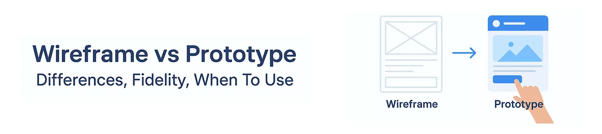
Wireframe vs Prototype: What’s the Difference for Product Teams

8 mins read
Summarize with AI:


The difference between wireframe and prototype is straightforward: one maps structure, the other tests behavior. Get that wrong, and you risk shipping a product your users never actually wanted.
Product teams burn real budget by confusing these two tools. A wireframe shows you where things go. A prototype shows you whether those things work. They answer different questions, and they belong at different stages of your development cycle.
This post covers both from a practical standpoint: clear definitions, how fidelity shifts between the two, a concrete example that grounds the distinction in something real, how prototype testing actually surfaces usability problems, and a decision framework you can apply immediately. If you have a new feature to spec out, a stakeholder presentation next week, or a development sprint that keeps getting derailed by late-stage design changes, what follows will help you move faster with fewer expensive surprises.
According to IBM's System Sciences Institute, fixing a defect in the post-development phase costs 4 to 5 times more than catching it during design, and up to 100 times more than catching it during requirements gathering. That number hits differently when you are the one signing off on a sprint that just doubled in length because a navigation flow nobody tested turned out to be completely broken.
The difference between wireframe and prototype is not an academic distinction. It directly shapes how much rework lands on your engineering team's plate.
For product managers, it affects scope clarity. A wireframe forces layout and hierarchy decisions before any interaction logic gets designed, which means your PRD has fewer moving parts when it reaches developers. For founders, it affects burn rate. For designers, it determines when feedback is actually useful versus when it costs hours to act on. For developers, it determines whether they build something once or rebuild it twice.
Here is a concrete example. A SaaS team was designing an onboarding flow and received stakeholder feedback mid-sprint, after engineering had already built the step sequence into the backend logic. One stakeholder wanted to collapse three steps into one. Reasonable request. But because the flow was already coded, the change required two days of backend refactoring on top of the UI work. Had that conversation happened at the wireframe stage, it would have taken a designer 20 minutes to redraw the layout and get sign-off.
That gap, two days of engineering time versus 20 minutes of design iteration, is exactly what understanding these two tools protects you from.
A wireframe is a low-detail, static layout that maps out the structural skeleton of a screen before anyone touches visual design or interaction logic. That is its entire job. It shows where elements live, how content is organized, and how screens connect to each other, without any distraction from color, typography, or branded imagery.
Think about a signup page wireframe. You would see a header placeholder at the top, a primary CTA button positioned above the fold, labeled form fields for name and email, helper text below each input, and a navigation bar across the top. No logo treatments. No color choices. Just placement and priority. That layout answers a critical question before anyone writes code: does this page structure actually make sense for what we need users to do?
That is the core value of wireframing. It lets your team debate information hierarchy and navigation flow before emotional attachment to visual decisions makes those conversations harder.
Understanding what a wireframe is not matters just as much. Teams routinely hand wireframes to stakeholders who then ask about button colors or font choices, which derails the whole exercise.
A wireframe is not:
When you treat it like any of those things, you pull the conversation in the wrong direction. Wireframes exist to validate structure fast, not to demonstrate what the finished product will look like. Once you need to test actual behavior, you have already moved past the wireframe stage and into prototype territory. Keeping that boundary clear is what makes the difference between wireframe and prototype work cleanly in your process.
A prototype is an interactive simulation of your product that lets real users experience flows and behaviors before developers write production code. Unlike a wireframe, which maps structure, a prototype answers a harder question: does this actually work the way users expect it to?
The fidelity you choose depends entirely on what you need to learn. Low-, mid-, and high-fidelity prototypes each serve a different validation goal, and picking the wrong level wastes time just as surely as skipping the step altogether.
Low-fidelity prototypes are linked static screens, sometimes even paper sketches with hand-drawn flows. No real visual design, no animation. You use these in early concept validation sessions where you need stakeholders to react to the idea, not the execution. Tools like Balsamiq or simple Figma artboards connected with basic hotspots get this done in a day or two.
Mid-fidelity prototypes sit between rough sketches and a polished UI. Navigation behaves correctly, key interactions work, but visual polish is minimal. This fidelity level is well-suited for internal stakeholder reviews where the conversation should focus on flow logic rather than branding. Figma and Adobe XD are the default choices here.
High-fidelity prototypes closely mirror the finished product: real typography, accurate spacing, micro-interactions, and conditional logic. You bring these into near-final interaction checks, investor demos, and developer handoffs where ambiguity about behavior or visual treatment creates real risk. Figma, Framer, and Axure handle this tier.
Once you have a prototype ready, prototype usability testing follows a straightforward process:
Five participants consistently surfaces the majority of critical usability problems. You do not need a large sample to find where the flow breaks.
One clarification worth making explicit: a prototype is not a minimum viable product, not a staging environment, and not production-ready code. It does not handle live data or scale under load. Its entire value comes from how fast you can test it, learn from it, and change it. The moment you treat it like a real build, you lose that speed.
Most teams understand wireframes and prototypes are different. Fewer teams understand how different, and that gap shows up in wasted review cycles and developer handoffs that spark more questions than they answer.
The table below covers the full picture across every dimension that matters when you are deciding which artifact to produce.
| Factor | Wireframe | Prototype |
|---|---|---|
| Primary purpose | Map layout and content structure | Simulate behavior and test real flows |
| Interactivity | Static, no clickable elements | Clickable, interactive, sometimes animated |
| Wireframe and prototype fidelity | Low to mid fidelity | Low, mid, or high fidelity depending on goal |
| Stage in workflow | Early, before visual design begins | After structure is validated |
| Feedback focus | Placement, hierarchy, navigation logic | Usability, task completion, interaction clarity |
| Stakeholder audience | Product managers, designers, technical leads | End users, investors, QA, developers |
| Common tools | Balsamiq, Whimsical, Figma (basic frames) | Figma (linked flows), Framer, Axure, InVision |
| Deliverable format | Static screens or sketches | Linked screen flows, often shareable via URL |
| Testing suitability | Limited, good for internal critique only | Strong, suitable for moderated usability sessions |
| Risk of misuse | Stakeholders treat it as a visual design commitment | Teams over-build it, delaying actual development |
| Developer handoff readiness | Low, needs accompanying annotations | Moderate to high with hi-fi prototype |
| Expected effort | Hours to one or two days | Days to multiple weeks |
Here is where it gets genuinely confusing, and why teams often argue about what they are actually looking at.
Clickable wireframes sit in between both categories. You build them in a low-fidelity style, but link the screens together so someone can navigate through a flow. Technically a wireframe in appearance, but it behaves like a low-fidelity prototype. Teams regularly call these prototypes when handing off to stakeholders.
Mid-fidelity prototypes add a layer of visual structure without committing to final brand decisions. Colors might be placeholder grays, typography approximate but not finalized. These feel more polished than wireframes but lack the pixel-precision of a hi-fi prototype.
Mockups sit in a completely separate lane. A mockup is a static, high-fidelity visual that shows exactly what the final product looks like but has no interactivity. Developers often receive mockups alongside a prototype during handoff. They answer "what does it look like?" while the prototype answers "how does it behave?"
Take a login screen. Your wireframe shows two input fields, a button, and a link for password recovery. Boxes represent the fields, nothing is styled, and the layout is roughly proportioned. You use this to confirm the hierarchy makes sense: does the password recovery link live below the form or above the CTA? Does the button label say "Log In" or "Continue"? These are structure questions, and your wireframe answers them fast.
Your prototype of that same login flow lets a tester type into the fields, tap the button, and land on a dashboard or an error state if credentials fail. Now you are watching real behavior. Does the user hesitate before hitting submit? Do they miss the password recovery link entirely? Those insights only surface when someone actually moves through the flow rather than imagining it from a static box layout.
Same feature, two different artifacts, two completely different questions answered. That is the practical difference between wireframe and prototype in action.
Knowing the difference between wireframe and prototype is only half the battle. The harder question is when to reach for each one. Here is a practical decision framework based on stage, team goal, and what you actually need to validate.
Start with a wireframe when you need to answer any of these:
If you answered yes to any of those, you are in wireframe territory. Build the static layout, get alignment, and move on.
Switch to a prototype when your goal shifts to:
These require something clickable. A static wireframe will not answer them.
Stage-based triggers:
Startup example: A three-person team building a new onboarding feature starts with a low-fidelity wireframe in Figma to agree on the three-screen sequence before writing a line of code. Once the PM and designer agree the structure holds, they link the screens into a clickable prototype and run five user tests in a week. Two screens get restructured based on what they observe. That is two weeks of avoided rework.
Enterprise example: A product team at a 500-person company needs sign-off from legal, compliance, and the head of operations before building a new approval workflow. They present wireframes in a stakeholder review to confirm the process logic matches how approvals actually work in the business. After three rounds of feedback and structural changes, they build a high-fidelity prototype for the final sign-off and developer handoff. Skipping the wireframe phase here would have meant building interactive flows around a broken process model.
The pattern is consistent: wireframes when you are validating what gets built, prototypes when you are validating how it works.
The practical question isn't really about understanding the difference between wireframe and prototype. You probably get that by now. The real question is: which one do you actually need right now, given where your project stands today?
Start with this quick checklist before you open any tool:
If you answered yes to the first or fourth question, you are still in wireframe territory. Everything else points toward prototyping.
Where mockups fit in all of this
Mockups sit between wireframes and prototypes, and most teams either skip them or confuse them with one of the other two. A mockup is a static, high-fidelity visual: it shows your final colors, typography, and brand treatment, but it has no interactivity. Think of it as a wireframe that's been dressed up for a visual review. You use mockups when stakeholders need to approve the visual design before anyone builds click-through interactions.
So the sequence, when you use all three, looks like this: wireframe to lock structure, mockup to approve visuals, prototype to test behavior.
Matching tools to the job
For wireframing, reach for Balsamiq or Whimsical when speed matters and you want something deliberately rough enough to invite structural feedback rather than design critique. The lo-fi aesthetic actually works in your favor here: it signals "this is not final" and keeps reviewers focused on layout.
For prototyping, Figma handles most teams well, especially for high-fidelity interactive flows that need to look close to the finished product. Sketch works similarly for Mac-based design workflows. Axure is worth considering when your interactions are genuinely complex, think conditional logic, dynamic content, or detailed state management, where Figma's prototyping layer starts to feel limited.
The tool category matters more than the specific tool. Low-fidelity wireframing tools keep you moving fast in early-stage decisions. Interactive prototyping tools give you something testable and stakeholder-ready once your structure is confirmed.
Use both when the project is complex, when stakeholder alignment is fragmented, or when you are building something users haven't seen before.
The difference between wireframe and prototype isn't a design technicality — it's a practical decision that shapes how much you spend, how long you take, and how many times your team rebuilds the same thing. The rule is straightforward: wireframes validate structure, prototypes validate behavior, and most serious product teams need both at the right stage to ship with confidence.
Before you move to your next sprint, run through this quick check:
If any of those answers is no, you're building on untested assumptions.
Brilworks works with founders and product teams through the full product discovery process, from initial wireframes to clickable prototypes and production builds. See how we've done it in practice by exploring our portfolio or talking to our product team directly.
The key difference in Wireframe vs Prototype is that wireframes are low-fidelity static blueprints showing layout and structure, while prototypes are interactive simulations demonstrating user flow and functionality. In the Wireframe vs Prototype comparison, wireframes focus on content placement and hierarchy, whereas prototypes showcase how the product actually works with clickable elements and transitions.
In deciding Wireframe vs Prototype timing, use wireframes early in the design process to establish information architecture, validate layouts with stakeholders, and get quick feedback on structure. Use prototypes later to test user interactions, validate design decisions through usability testing, and demonstrate functionality to developers. The Wireframe vs Prototype decision depends on your project phase and validation needs.
Fidelity in Wireframe vs Prototype refers to detail level and realism. Wireframes typically range from low-fidelity (basic sketches) to mid-fidelity (detailed layouts), while prototypes span low-fidelity (clickable wireframes) to high-fidelity (pixel-perfect interactive designs). Understanding fidelity in Wireframe vs Prototype helps teams choose appropriate detail levels for each project stage.
Time investment in Wireframe vs Prototype differs significantly: basic wireframes take hours to 1-2 days, detailed wireframes require 3-5 days, low-fidelity prototypes need 1-2 weeks, and high-fidelity prototypes take 2-4 weeks. The Wireframe vs Prototype timeline depends on complexity, number of screens, and required interactions.
Popular tools for Wireframe vs Prototype include Figma, Sketch, and Adobe XD (both wireframes and prototypes), Balsamiq and Whimsical (wireframes), InVision and Framer (prototypes), and Axure (advanced prototypes). Modern Wireframe vs Prototype tools often support both, allowing designers to evolve wireframes into prototypes within the same platform.
You might also like
Hello, we are BRILLIAN’S. Trying to make an effort to put the right people for you to get the best results. Just insight !