A chart can explain a number faster than a paragraph ever could. It can also make a bad conclusion look convincing.
That is the part of data visualization that often gets overlooked. The goal isn't simply to turn data into something visual. The goal is to make the right information easier to understand without distorting what the data actually says.
Consider a sales dashboard with revenue, customer growth, conversion rates, and monthly targets. All the numbers may be correct, but that doesn't automatically make the dashboard useful. If the important trend is buried between decorative elements, the colors have no clear purpose, or the viewer can't tell what a number should be compared against, the visualization creates more work instead of reducing it.
Good data visualization starts with the question you're trying to answer. In a broader business intelligence development process, those questions determine what data needs to be surfaced and how it should be presented.
The following 12 data visualization best practices cover the fundamentals that make a visualization easier to understand, more accurate, and more useful for the people who rely on it.
What Makes a Good Data Visualization?
A good data visualization does more than present information neatly. It helps the viewer understand something that would be harder to see in the raw data.
That could be a sudden change in sales, a gap between two customer segments, an unusual spike in website traffic, or a metric that has been steadily moving in the wrong direction. The visualization should make that insight easier to find without making the viewer work through unnecessary detail first.
There are six qualities that matter most:
1. Clarity
The viewer should be able to tell what the visualization is showing without having to decode it. Clear labels, sensible chart choices, readable scales, and a straightforward layout all help. If someone needs a separate explanation to understand what the chart is saying, the design probably needs another look.
2. Accuracy
A visualization should represent the underlying data honestly. This includes using appropriate scales, showing proportions correctly, and avoiding design choices that exaggerate or minimize differences. A chart can be visually impressive and still give the wrong impression if the data has been presented selectively or misleadingly.
3. Relevance
Not every available data point belongs in the visualization. A useful chart focuses on the information that matters to the question at hand. Adding more metrics may make a dashboard look comprehensive, but it can also make the important signal harder to spot.
4. Context
Numbers rarely mean much on their own. That context also depends on having reliable data quality behind the visualization. A well-designed chart cannot compensate for incomplete, inconsistent, or inaccurate data. A revenue figure becomes more useful when you can compare it with the previous period, a target, or another relevant benchmark. Context gives the viewer a way to judge whether a number is good, bad, changing, or simply normal.
5. Accessibility
A visualization should work for the people who need to use it. Color choices, text size, contrast, labels, and interaction patterns can all affect how easily someone interprets a chart. Accessibility is particularly important when information is being shared across a large organization, where you cannot assume every viewer will interact with the visualization in the same way.
6. Actionability
The best visualizations help people decide what to do next. A sales leader might need to identify an underperforming region. A product team might need to find where users are dropping off. An operations manager might need to spot an unusual change before it becomes a larger problem.
If the visualization makes the important information easier to see and act on, it is doing its job.
10 Data Visualization Best Practices
There is no shortage of ways to make a chart look polished. The harder part is making sure the chart actually helps someone understand the data.
A useful visualization comes down to a series of decisions: what to show, what to leave out, how to structure the information, and how much guidance the viewer needs. The following practices cover those decisions and help create visualizations that are easier to understand and more useful in real-world business settings.
1. Start With the Question, Not the Chart
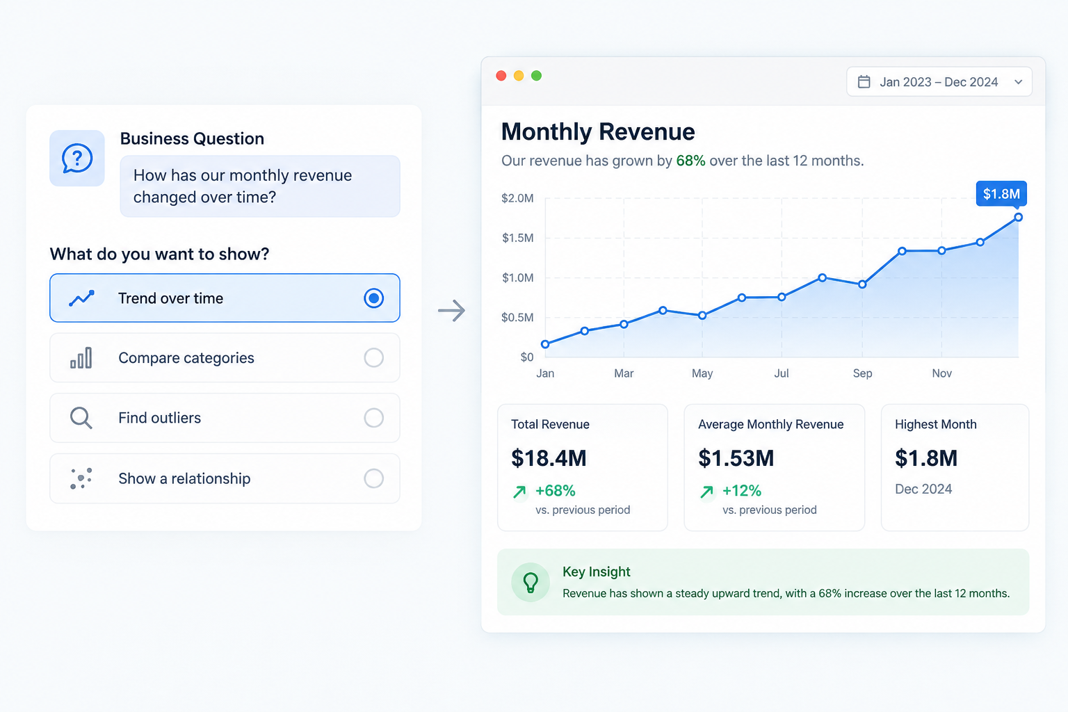
It is easy to open a visualization tool, pick a chart that looks good, and start adding data. That is usually where problems begin. Before choosing a chart, decide what you actually want the viewer to understand. Are you trying to show a trend, compare categories, find an outlier, or understand a relationship?
The question should determine the visualization, not the other way around. Once you know what you want to answer, it becomes much easier to decide which data belongs in the chart and which can be left out.
2. Understand Your Audience and Their Needs
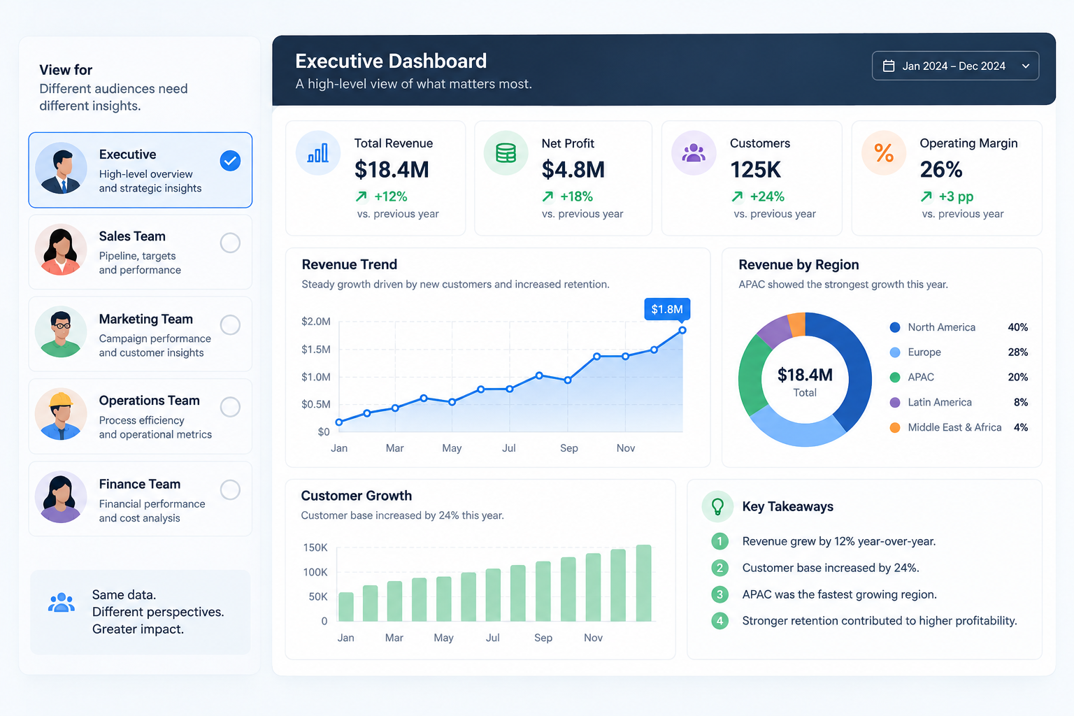
The same data can tell different stories depending on who is looking at it. An analyst may want to explore the numbers in detail, while an executive may only need to know whether performance is on track and where attention is needed.
Before designing a visualization, think about who will use it, what they already know, and what they need to get from it. A detailed revenue breakdown might be useful for a finance team, while a leadership dashboard may need only revenue growth, target attainment, and the areas falling behind.
3. Choose the Right Chart for the Data
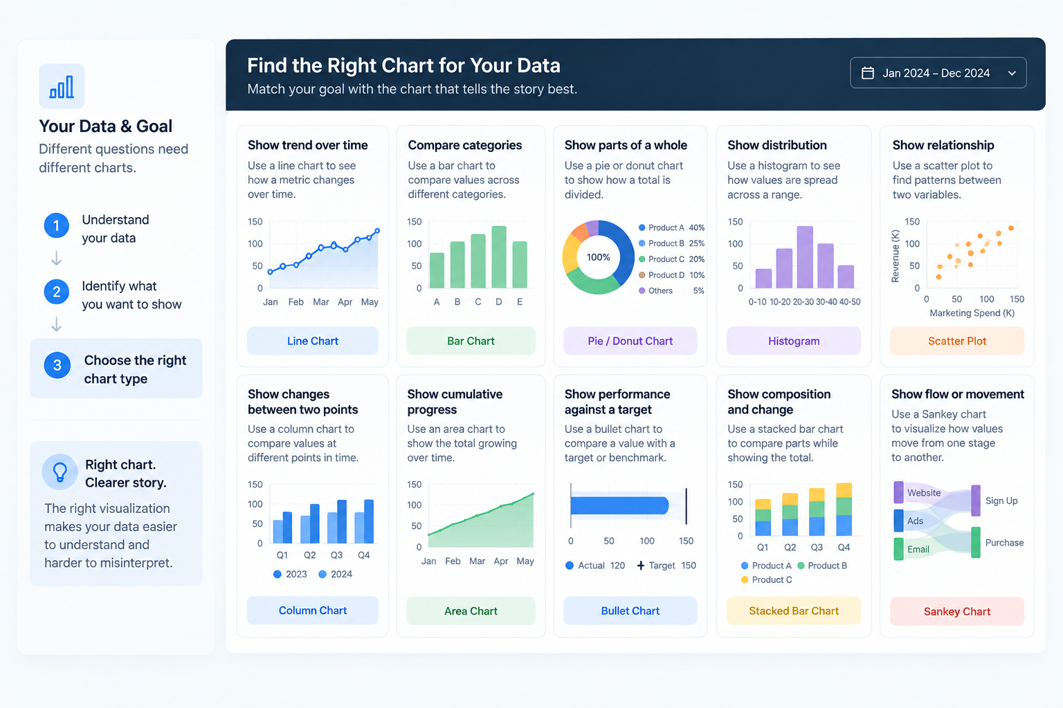
Different charts make different patterns easier to see. A line chart works well for trends over time, a bar chart makes category comparisons straightforward, and a scatter plot can reveal relationships between two variables. The choice should follow the relationship you want the viewer to notice.
Avoid choosing a chart simply because it looks interesting or happens to be available in your BI tool. A familiar chart that makes the intended comparison obvious is often more effective than a complicated one that needs explaining.
4. Keep Your Visualization Simple
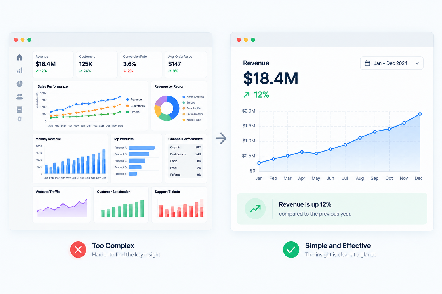
More information does not necessarily make a visualization more useful. Adding another metric, color, label, or filter can gradually turn a clear chart into something the viewer has to decode.
Remove anything that does not help communicate the main point. That might mean reducing unnecessary gridlines, decorative elements, excessive labels, or colors that carry no meaning. A complex dataset may require a detailed dashboard, but the design itself should not add unnecessary complexity.
5. Establish a Clear Visual Hierarchy
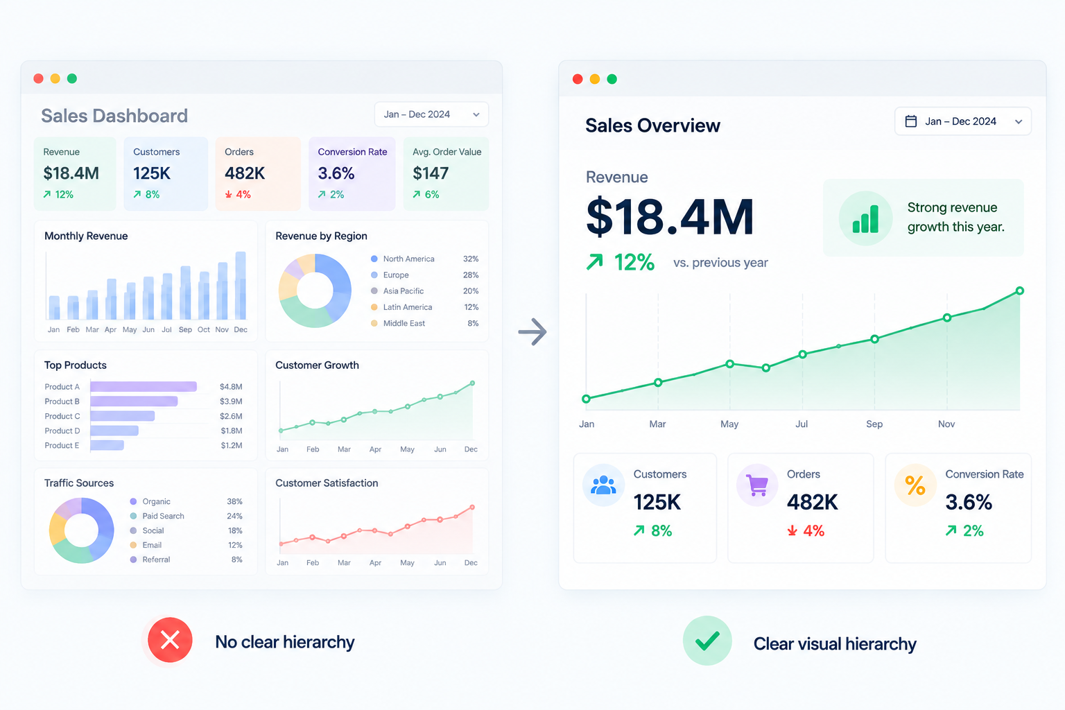
Not every piece of information in a visualization deserves the same amount of attention. A key metric might need to stand out, while supporting information can take a quieter position on the page.
Use size, position, spacing, contrast, and emphasis to guide the viewer through the information. Think about what they should notice first and what should come next. When everything is given equal visual weight, nothing stands out.
6. Use Color to Communicate, Not Decorate
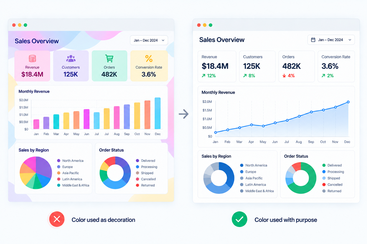
Color can highlight an important number, separate categories, or show whether a metric is above or below a target. But when every element has a different color, those distinctions quickly lose their meaning.
Use a limited palette and give each color a clear purpose. Keep those meanings consistent across the visualization, especially in dashboards with multiple charts. And when color carries important information, support it with labels, shapes, or other visual cues so the message does not depend on color alone.
7. Write Clear, Insight-Driven Titles and Labels
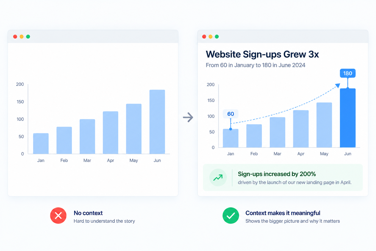
A viewer should not have to study a chart to figure out what they are looking at. A title such as “Monthly Revenue” tells the reader what the chart contains, while “Revenue grew 18% over the last six months” immediately points toward an insight.
Labels deserve the same attention. Use familiar terms, include units where necessary, and avoid unexplained abbreviations. When possible, label important data points directly instead of making the viewer constantly move between the chart and its legend.
8. Add Context to Make Data Meaningful
A number rarely tells the whole story by itself. Revenue of $500,000 might sound impressive until you learn that the target was $750,000. A 10% increase may look strong until you compare it with the previous year's 25% growth.
Give viewers something meaningful to compare against, such as a previous period, target, benchmark, or relevant average. Annotations can also help draw attention to unusual changes or explain events that affected the data.
9. Design for Accessibility
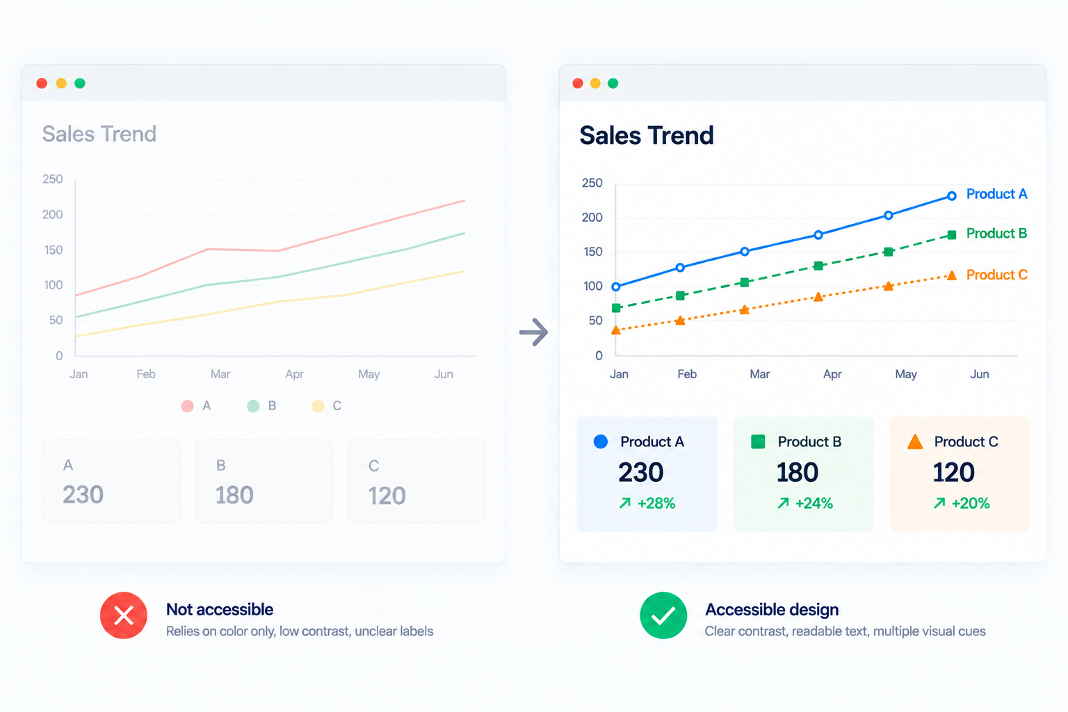
A visualization is only useful if the people viewing it can actually interpret it. Small text, low contrast, confusing color combinations, and information that depends entirely on color can make otherwise good visualizations difficult to use.
Use sufficient contrast, readable typography, clear labels, and color combinations that remain distinguishable for people with color vision deficiencies. Accessibility should be considered during the design process rather than treated as something to check after the visualization is finished.
10. Use Interactivity With a Purpose
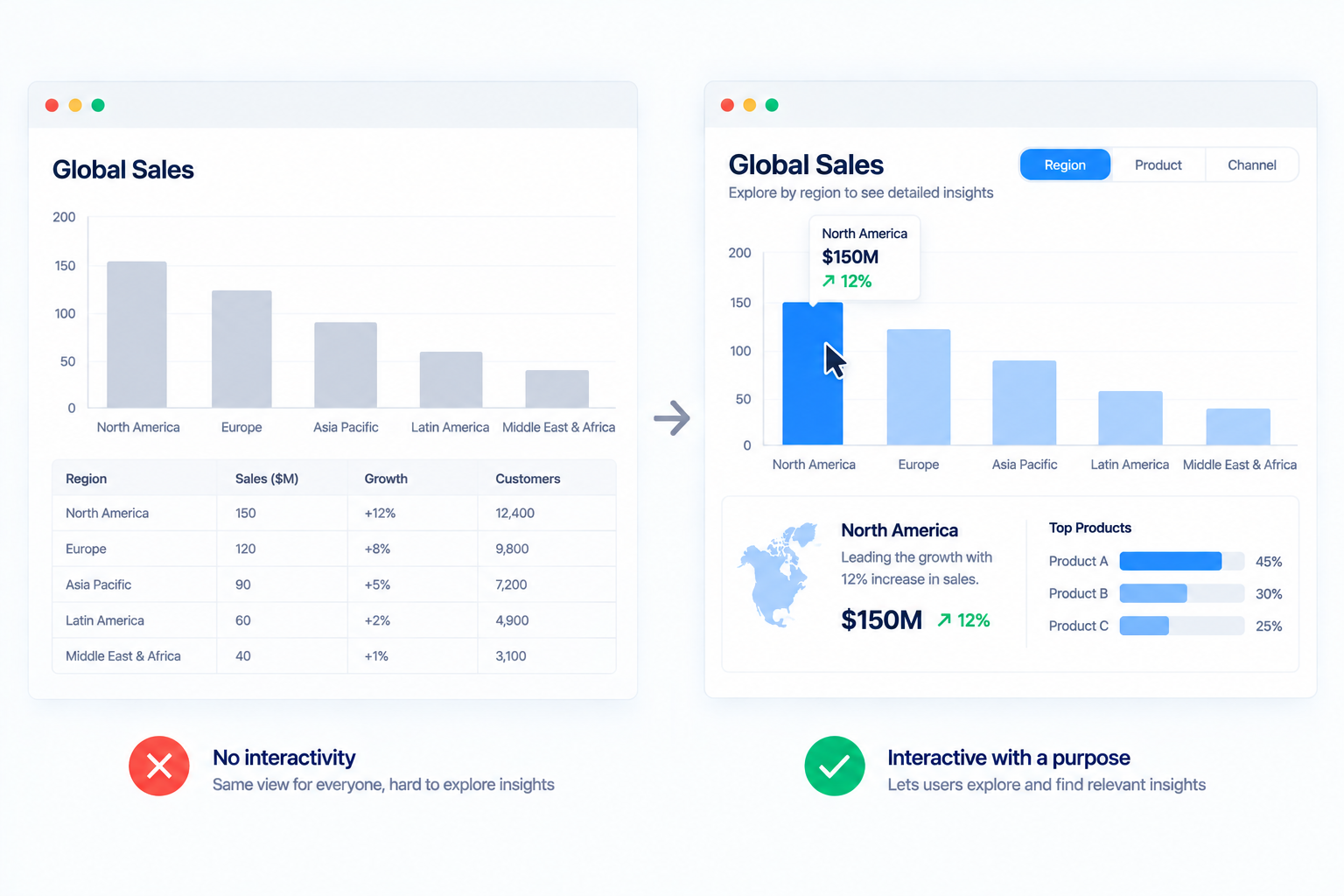
Filters, drill-downs, tooltips, and interactive elements are common features across modern BI tools and can give users more control over the data. But adding more interaction does not automatically make a visualization better.
Every interactive element should serve a clear purpose. A filter that helps a regional manager focus on their territory is useful; a dozen filters that make a simple chart difficult to navigate are not. Start with the information users need most, then add interaction where it helps them explore further.
How to Choose the Right Data Visualization
Choosing a chart becomes much easier when you start with the relationship you want to show. Instead of asking which visualization looks best, ask what the viewer needs to compare, notice, or understand.
A simple way to narrow it down is to match the purpose of the visualization with the chart type:
|
What you want to show
|
Useful chart types
|
|
Change over time
|
Line chart, area chart
|
|
Compare categories
|
Bar chart, column chart
|
|
Rank items
|
Horizontal bar chart
|
|
Show part of a whole
|
Pie chart, donut chart, stacked bar
|
|
Understand a relationship
|
Scatter plot
|
|
Show distribution
|
Histogram, box plot
|
|
Track performance against a target
|
Bullet chart, bar chart
|
|
Show geographic patterns
|
Choropleth map, symbol map
|
These are starting points, not strict rules. The amount of data, number of categories, audience, and level of detail can all change the best choice. When two chart types could work, go with the one that makes the intended comparison easier to spot and requires less explanation. In larger analytics environments, data governance also matters because consistent definitions and trusted data make visualizations more reliable across teams.
The simplest test is to look at the finished visualization and ask: Can someone understand the main point without being told what to look for? If they can, you're probably on the right track.
Conclusion
Good data visualization is ultimately about making information easier to understand and decisions easier to make. The best charts are not necessarily the most detailed or visually impressive. They are the ones that make the important pattern clear, provide enough context to interpret it, and help the viewer know what deserves attention.
These data visualization best practices provide a practical foundation, whether you're building a single report, a business intelligence dashboard, or a larger analytics solution. Start with the question, choose the visual carefully, remove distractions, and always design around the people who will use the information.