Last updated May 7, 2026
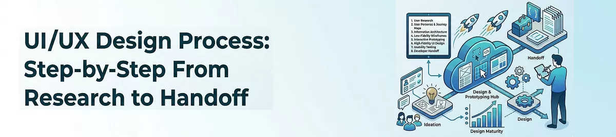
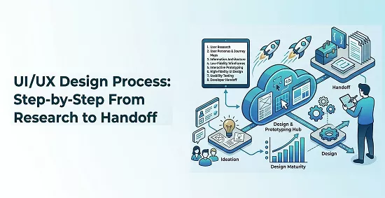
UI UX Design Process: From Research to Handoff for Teams

6 mins read
Summarize with AI:


A product's success often comes down to how well its UI/UX design process was executed before a single line of code was written. Skip steps, rush research, or hand off sloppy specs, and your development team ends up rebuilding screens that should have been right the first time. That costs real money and pushes launch dates further out.
Yet many teams still treat design as a loosely defined phase between "we have an idea" and "start building." There's no shared framework, no clear milestones, and no structured way to validate decisions before committing engineering resources. The result? Products that look fine but frustrate the people using them.
At Brilworks, our UI/UX design team works alongside product engineers from day one. We've refined a repeatable design process through hundreds of projects across fintech, healthcare, e-commerce, and logistics, where getting the user experience wrong isn't just inconvenient, it's a dealbreaker. This article walks you through each stage of that process, from initial user research through developer handoff, so you can apply the same structure to your own product workflow.
Before diving into steps, it helps to be clear on what the UI/UX design process actually covers and why the two disciplines are treated together. UI (user interface) refers to everything visual: buttons, typography, color, spacing, and layout. UX (user experience) refers to the broader journey: how someone moves through a product, what they feel at each point, and whether they accomplish what they came to do. Both disciplines overlap heavily, which is why separating them into distinct phases often creates gaps that hurt the final product.
Many teams treat UI as the "design work" and UX as the "research phase," but that framing leads to problems. UX decisions directly shape UI choices: if research shows users scan in an F-pattern, that affects where you place your most critical calls to action. Similarly, a well-tested UI interaction can reveal UX flow problems that your wireframes missed. You need both disciplines in conversation throughout the entire process, not handed off sequentially like a relay race.
Treating UX and UI as separate handoffs is one of the most common reasons products require expensive redesigns after launch.
Think of UX as the architecture and UI as the interior design. An architect who never talks to the interior designer ends up with rooms where the furniture won't fit. The same principle applies to digital products, where navigation structure and visual hierarchy need to be designed together from the start.
Without a defined process, design decisions get made reactively, often during development when changes are most expensive. A structured design process gives your team clear milestones, defined deliverables, and decision points where stakeholders can weigh in before work becomes locked in code. It also reduces the number of revision cycles because you validate assumptions early through research and testing rather than discovering problems during a product demo.
Teams that follow a repeatable process also move faster over time. Each phase produces documented outputs (personas, flows, prototypes, component specs) that carry forward to future projects and onboard new team members without requiring institutional memory.
The full design process breaks into four connected phases. Each phase feeds the next, and all of them require input from both designers and stakeholders to stay aligned.

| Phase | What happens | Primary output |
|---|---|---|
| Define | Align on goals, scope, and constraints | Project brief, success metrics |
| Research | Study users, competitors, and market context | Personas, journey maps, findings report |
| Plan | Structure information architecture and map flows | Sitemaps, user flows, wireframes |
| Design and validate | Build prototypes, run usability tests, hand off specs | High-fidelity mockups, dev-ready specs |
Each phase has distinct activities, but they are not fully linear. You will loop back from prototyping to planning when tests reveal structural problems, and you may revisit research when the scope shifts. The goal is not to follow a rigid sequence but to ensure nothing important gets skipped because the team was moving too fast.
The define phase is where the entire ui ux design process either gets set up for success or quietly begins to fail. Before your team opens any design tool, you need to know what you're building, who it's for, and what boundaries you're working within. Unclear goals at this stage lead to misaligned prototypes, wasted research cycles, and scope creep that pushes timelines past every estimate.
A design team that starts without a written brief is essentially solving a problem no one has formally agreed on.
Your goals need to be specific enough to evaluate later. Vague objectives like "improve user experience" give no one a clear target. Instead, define goals in terms of measurable outcomes that connect back to business impact. Use this template to document your project goals before moving forward:
| Goal | Metric | Target | Timeline |
|---|---|---|---|
| Reduce checkout drop-off | Cart abandonment rate | Below 25% | Q3 |
| Increase onboarding completion | % of users finishing setup | Above 70% | Launch |
| Improve task success rate | Usability test completion | 85%+ | Pre-launch test |
For each goal, identify one measurable metric and a realistic target number. If your stakeholders cannot agree on what success looks like in that table, you are not ready to move into design yet. Alignment at this stage prevents the endless revision cycles that plague teams who skip it.
Once goals are set, document what is in scope and out of scope explicitly. A scope document prevents stakeholders from adding features mid-sprint and derailing the schedule. List every platform, user role, and core flow your team will cover in this design cycle, and get written sign-off from the project sponsor before research begins.
Your constraint list should cover four areas: budget, timeline, technical limitations, and platform requirements. If your backend cannot support real-time updates, that constraint directly affects which interaction patterns are viable. Capturing these limits early keeps your design decisions grounded in what can actually ship rather than what sounds good in a kickoff meeting.
Research is where your assumptions get tested against reality. Most design problems come from teams that skip this step and build based on internal opinions about what users want. Inside the full ui ux design process, this phase gives you the evidence you need to make decisions that hold up once real people start using your product.
You need direct input from the people who will actually use what you're building. User interviews are the most reliable way to uncover this, and you don't need a large sample size: five to eight interviews with people who match your target user profile will surface the patterns that matter. Record each session (with permission), and listen for repeated frustrations, workarounds, and phrases that signal unmet needs.
Use this interview guide as a starting point, then adapt it to your specific product:
| Question type | Example question |
|---|---|
| Context | "Walk me through how you currently handle [task]." |
| Frustration | "What part of that process slows you down the most?" |
| Workaround | "Have you found any ways to get around that problem?" |
| Goal | "What would make that task feel completely solved for you?" |
The most valuable user research insight rarely comes from answers to direct questions; it comes from watching what people do differently than what they say.
After your interviews, consolidate findings into user personas: single-page documents that summarize a user type's goals, pain points, and behaviors. Each persona should be grounded in interview data, not guesses, and should stay visible throughout the rest of the design process.
Your users have likely tried other solutions before yours. Competitive analysis tells you what the market already offers, where those products fall short, and where there is room to differentiate. Pick three to five direct competitors and evaluate each on navigation structure, core user flows, onboarding, and visual patterns.
Document your findings in a simple comparison matrix that maps each competitor against your intended features. Look specifically for areas where multiple competitors share the same weakness, because those gaps are your clearest opportunity to deliver a better experience than anything currently available.
Planning is the phase where your research findings turn into a navigable structure. Before you sketch a single screen, you need to define how information is organized and how users will move through your product. Skipping this step in the ui ux design process forces designers to make structural decisions inside a visual tool, where changes are slower and harder to evaluate objectively.
Information architecture (IA) is the skeleton of your product. It defines how content and features are grouped, labeled, and connected. A clear IA means users can predict where to find things without needing to explore. Start by listing every feature and content type your product includes, then group related items into logical categories.
If users cannot name what they expect to find in a navigation category, your labels are working against you, not for you.
A simple card sorting exercise can validate your groupings before you commit to them. Write each feature on a separate card and ask five to ten target users to organize the cards into groups that feel natural to them. Use those groupings to build your sitemap, a flat diagram that shows every page or screen and how they connect hierarchically. Here is a basic sitemap template you can adapt:
Home
├── Dashboard
│   ├── Overview
│   └── Reports
├── Account
│   ├── Profile
│   └── Settings
└── Support
    ├── Help Center
    └── Contact
A user flow traces the exact path a specific user takes to complete a specific task. Map one flow per core task your product supports. Each flow should start with a trigger (the moment the user decides to act), move through each decision point, and end with a clear success state. Use a simple format: rectangles for screens, diamonds for decisions, and arrows for direction.

Your flows reveal structural problems that wireframes cannot. If a flow requires seven steps to complete a task that should take three, you find that problem now, not after screens are already polished. Document each flow as a numbered step list alongside the diagram so developers and stakeholders can follow the logic without reading visual notation.
This is the phase where your ui ux design process becomes visible. You move from structural diagrams to actual screens, then validate those screens with real users before passing anything to developers. Every decision you made in the previous three steps now shows up in your visual output, which means skipping earlier phases forces you to make structural guesses inside your design tool where corrections are costly.
Start with low-fidelity wireframes for each core flow before adding any visual polish. Wireframes let you validate layout and interaction logic without stakeholders getting distracted by color or typography. Once your layouts are approved, apply your visual design system: colors, type scale, spacing, icons, and component states. Build every interactive state (hover, error, empty, loading) because developers will need them, and they are easy to forget when you are focused on the happy path.
Skipping error and empty states in your mockups is one of the most common ways design specs break down during development.
Build a clickable prototype in your design tool and test it with five to eight users who match your target persona. Give each participant a task to complete without guiding them, then observe where they hesitate, misclick, or stop. Document every failure point and rank them by severity using this simple scale:
| Severity | Definition | Action |
|---|---|---|
| Critical | User cannot complete the task | Fix before handoff |
| Major | User completes task but with significant struggle | Fix before handoff |
| Minor | User completes task with slight confusion | Fix if time allows |
| Cosmetic | User notices something odd but continues | Log for future iteration |
Fix critical and major issues by revising your designs, then retest if the changes are significant. Minor and cosmetic issues can be logged in your backlog for the next iteration cycle.
Your final deliverable is a handoff package that gives developers everything they need without requiring follow-up calls. Include annotated mockups, a component library with documented states, spacing and typography tokens, and a written interaction spec for any animated or conditional behavior. Tools like Figma let you attach redline annotations directly to frames so developers can inspect exact values without guessing.

The ui ux design process outlined in this guide gives you a repeatable framework you can apply to any product, whether you're building from scratch or fixing a product that's already shipping. Each phase builds on the last, and the outputs from research, planning, and testing compound into clearer specs, fewer revision cycles, and faster development.
Your next move is to identify the phase where your current process breaks down most often and start there. If your team skips research, run three user interviews before your next sprint. If handoff specs are vague, build a component library with documented states. Small improvements in process discipline add up quickly across a full project cycle.
When you need a team that applies this framework from day one and works alongside your engineers throughout the build, talk to the Brilworks design and engineering team about your next product.
The UI UX design process is a structured approach used to create user-friendly and visually appealing digital products. It typically includes stages like user research, wireframing, prototyping, testing, and developer handoff to ensure a seamless user experience.
The key stages in the UI UX design process include research, information architecture, wireframing, UI design, prototyping, usability testing, and final handoff. Each stage helps refine the product and improve user satisfaction.
The UI UX design process helps reduce guesswork and ensures that design decisions are based on user needs. It leads to better usability, higher engagement, and fewer revisions during development.
The duration of the UI UX design process depends on the complexity of the project. Smaller projects may take a few weeks, while larger applications can take several months due to multiple iterations and testing phases.
Common tools used in the UI UX design process include design and prototyping tools like Figma, Adobe XD, and Sketch, along with usability testing and collaboration tools to streamline the workflow.
You might also like
Hello, we are BRILLIAN’S. Trying to make an effort to put the right people for you to get the best results. Just insight !